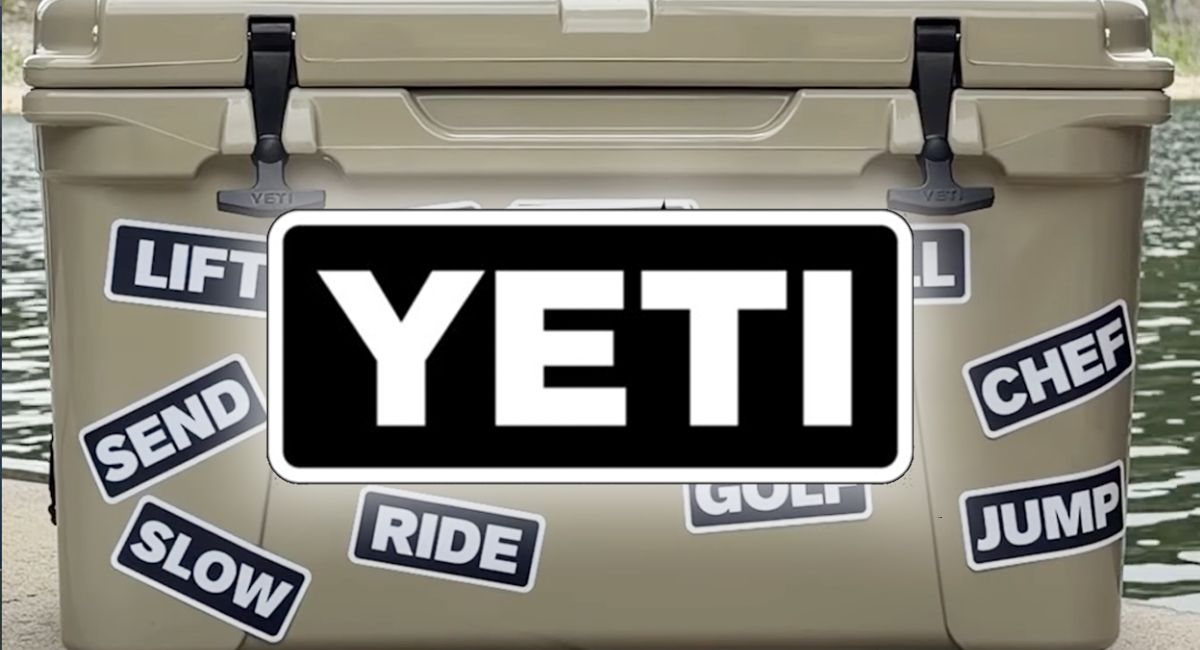
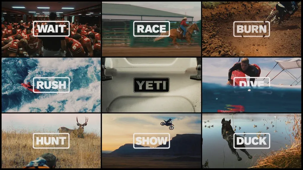
Some brands are so strong they don't need a logo at all, or at least not all of their logo all the time. There are also plenty of powerful textless logos that immediately identify a brand without words. But can a brand identify itself without a name when its logo is merely four simple sans serif capitals in a slightly rounded black-and-white box? That's what the outdoor cooler maker Yeti is aiming for. The brand's logo design is so minimal that there's little more to it other than the Yeti name, but its clever new campaign shows that with precise execution even the simplest logotype can do a lot of lifting. Yeti's celebrating its 20th anniversary this year. As well as its flagship coolers, it now makes drinkware, kitchen gear, bags and even beds for dogs. The 'FOUR Letters' campaign devised by Wieden+Kennedy Portland sees the Yeti logo replaced with a revolving series of words that you might expect to come up on a presentation of brand associations, including 'Wild' 'Hunt', 'Fish', 'Hike' and 'Snow.…