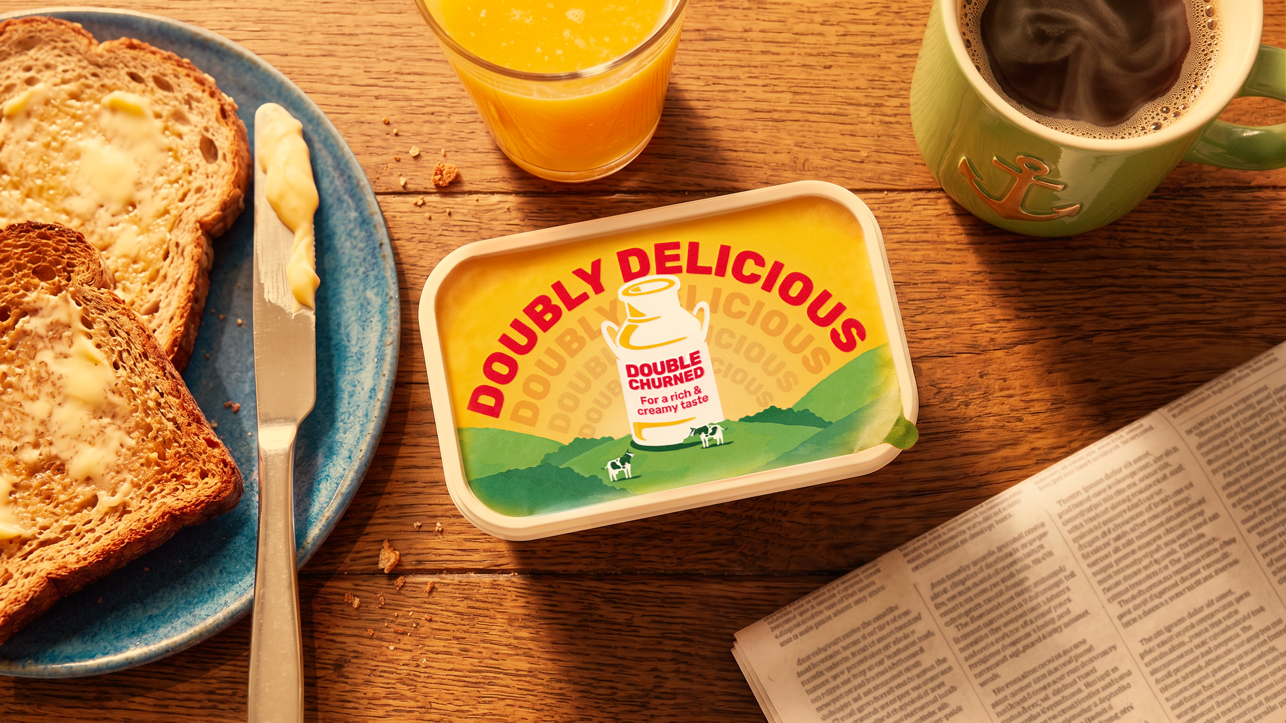
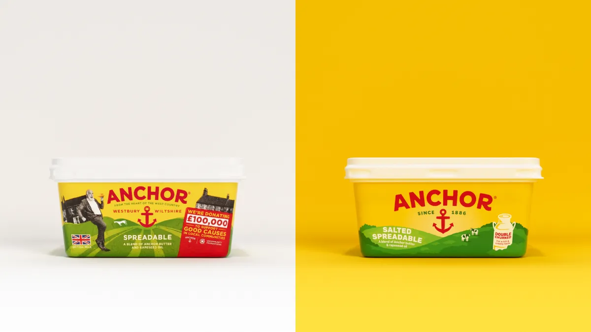
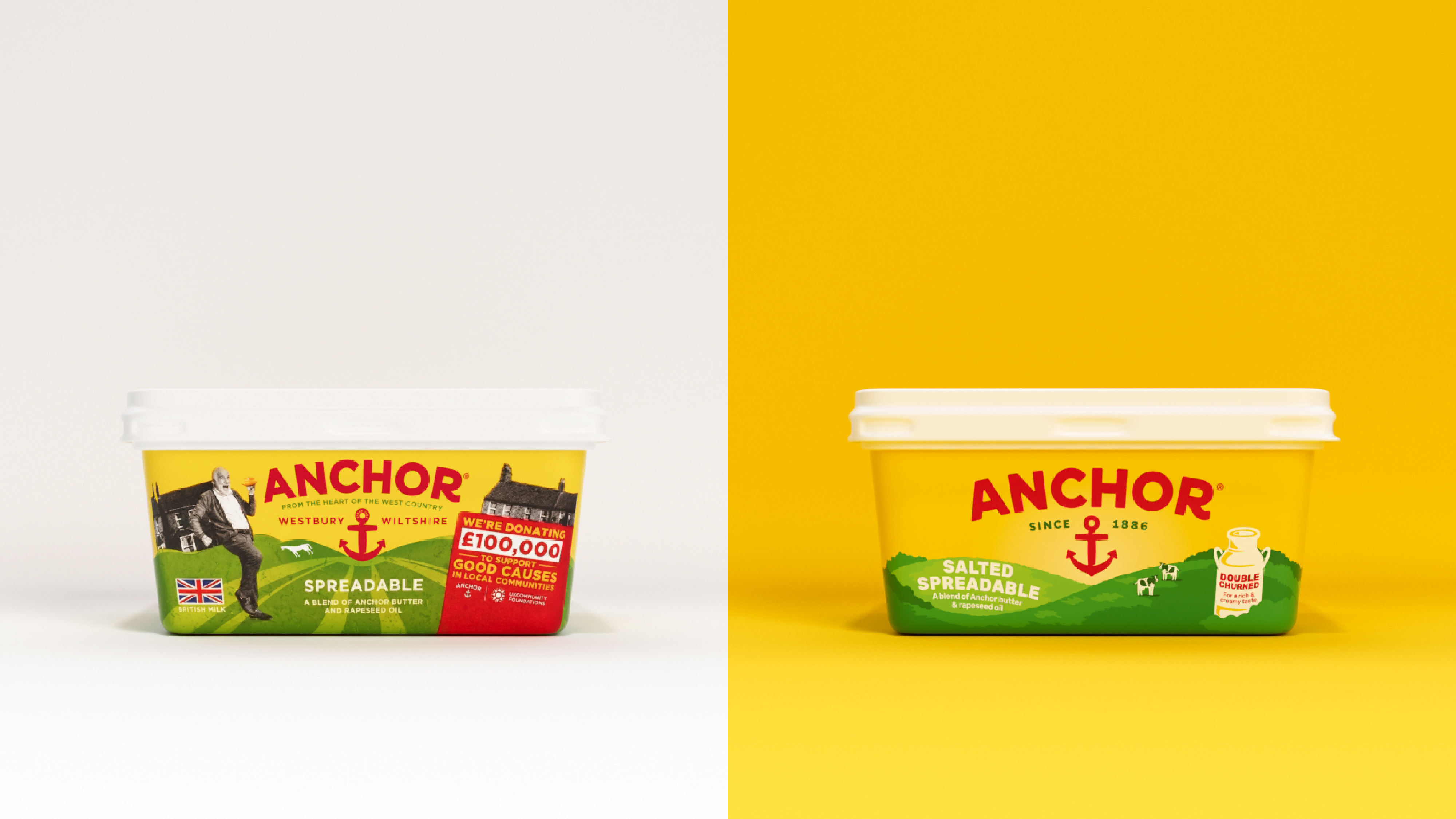
(Image credit: Anchor/Pearlfisher) Butter brand Anchor has unveiled a refreshed brand identity that excels in refinement, not reinvention. With a more focused approach to its core brand, the new look shines in its simple elevation, proving that the best rebrands don't always have to be about grand redesigns. With over 100 years of brand heritage, Anchor's new look is all about honouring its legacy by stripping the brand back to its roots. With a new wordmark, softened illustrations and a simplified brand aesthetic, Anchor's refresh perfectly embodies the brand's spirit of warmth and authenticity. (Image credit: Anchor/Pearlfisher) Partnering with brand design agency Pearlfisher , Anchor's new identity centres around its refined brand system. The once playful yet unfocused packaging of the past has been replaced with a sleek reinvention of the traditional wordmark, subtly softening the design with smoother curves and balanced proportions to reflect the brandʼs breezy aesthetic.…