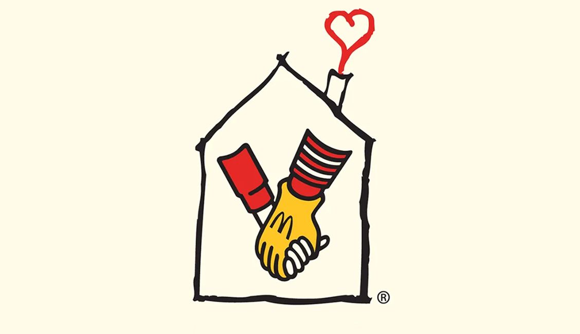
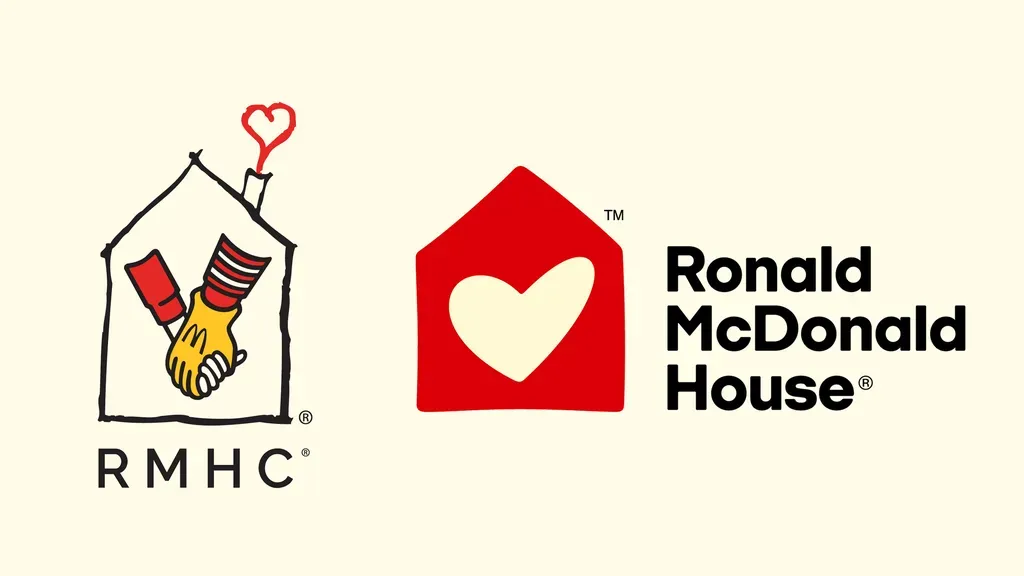
Some rebrands are criticised as being unnecessary, but the new logo design for Ronald McDonald House Charities was desperately overdue. The fastfood brand's biggest charity initiative is growing, and it finally has a versatile, warm but more mature identity fit for that purpose – thankfully, without any slightly sinister-looking references to a long-retired mascot. Ronald McDonald House old logo (left) and new logo design (right) (Image credit: Ronald McDonald House) Ronald McDonald House began life Philadelphia in 1974. It's since grown to more than 250 chapters, which provide accommodation – both out-of-hospital housing and in-hospital family rooms – to ill children and their families in 62 countries. An ambitious expansion plan now aims to double the number of families served by 2030. The previous logo design featured a childlike drawing of a house containing the gloved hand of Ronald McDonald clasping that of a child... Well, they were different, more innocent times, I guess.…