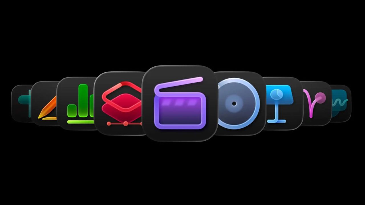
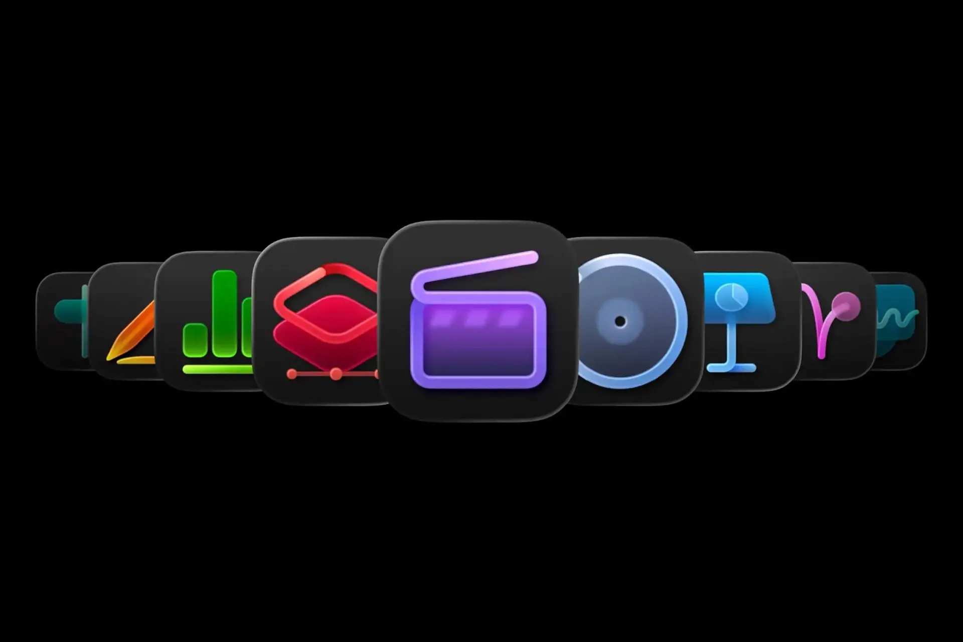
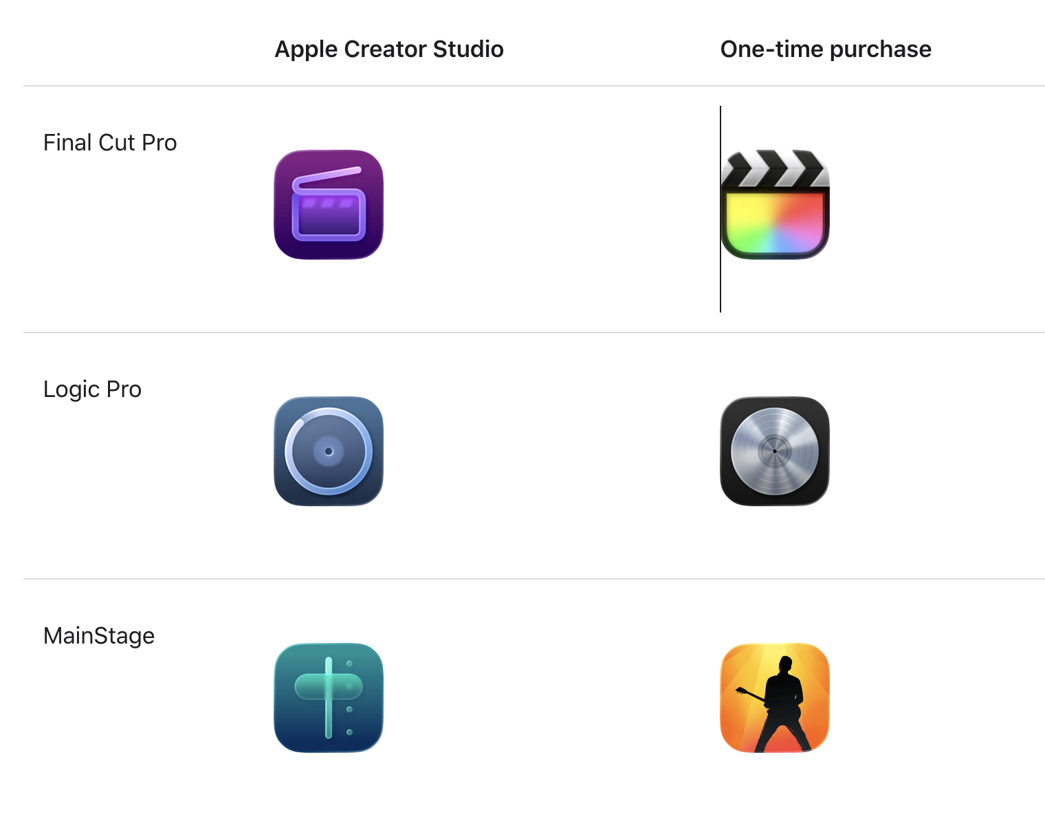
(Image credit: Apple) Apple recently released a new version of Creator Studio and, with it, a set of new app icons. So far, so unremarkable. But these icons are so confusing that Apple felt compelled to release a whole user guide to help you navigate them . The guide exists because there are now two versions of each app – one via subscription, the other through a one-off payment – each with its own icon, and telling them apart is far from obvious. Following the style of the macOS Tahoe update, the new icons also abandon the expressive, image-led designs of old in favour of a uniform rounded-square format that mirrors iOS . The result is a homogenised look that strips each app of its individual personality. The new colour scheme doesn't help either: muted and dull against the vibrancy of the old one. (Image credit: Apple) The fundamental principle of an icon is that you can read it at a glance. That's hard enough here, but the bigger problem is that these icons come as a suite, appearing side by side.…