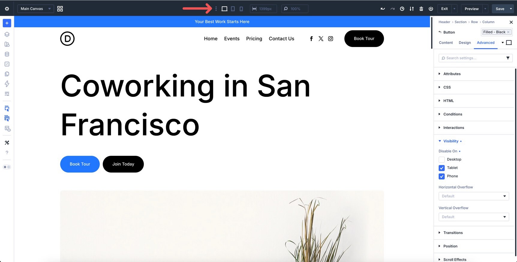
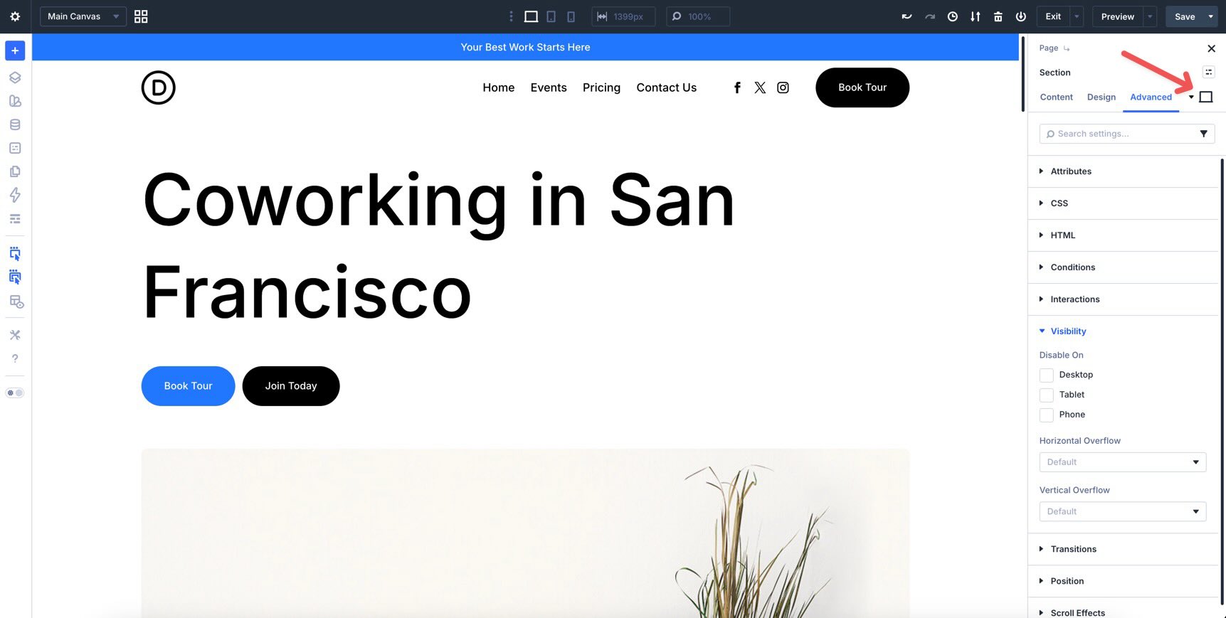
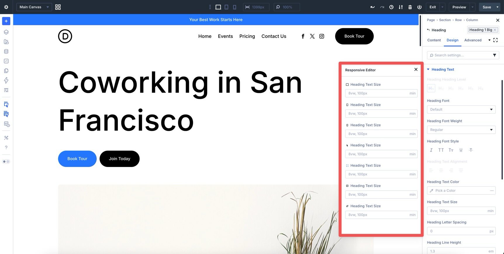
Welcome back to the Divi 5 Mastery Course. In Parts 5–9, we built the coworking space website’s homepage, header, footer, global templates, and core inner pages. Then, in Parts 10–11, we strengthened those layouts with Flexbox and CSS Grid . Responsiveness was part of the build all along, but this final pass is where we refine everything. The goal is to make the site feel polished across phones, tablets, desktops, wider screens, and the breakpoints in between. In this part, we’ll audit the full site, fine-tune key layouts, use Divi 5’s responsive tools, and keep global consistency with your Design Variables and Presets . By the end, your site will be much closer to launch-ready. Let’s dive in.…