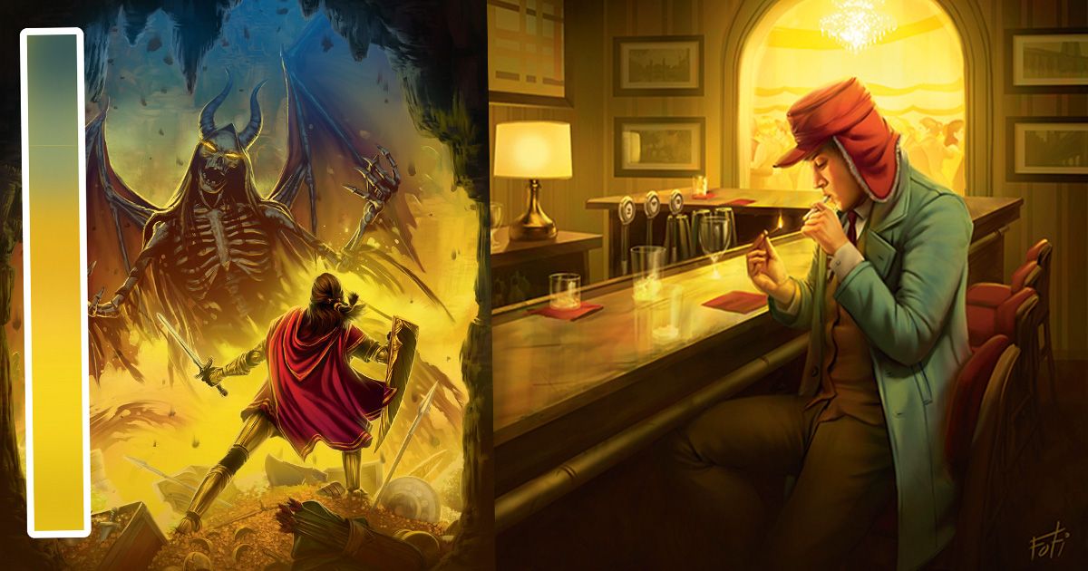
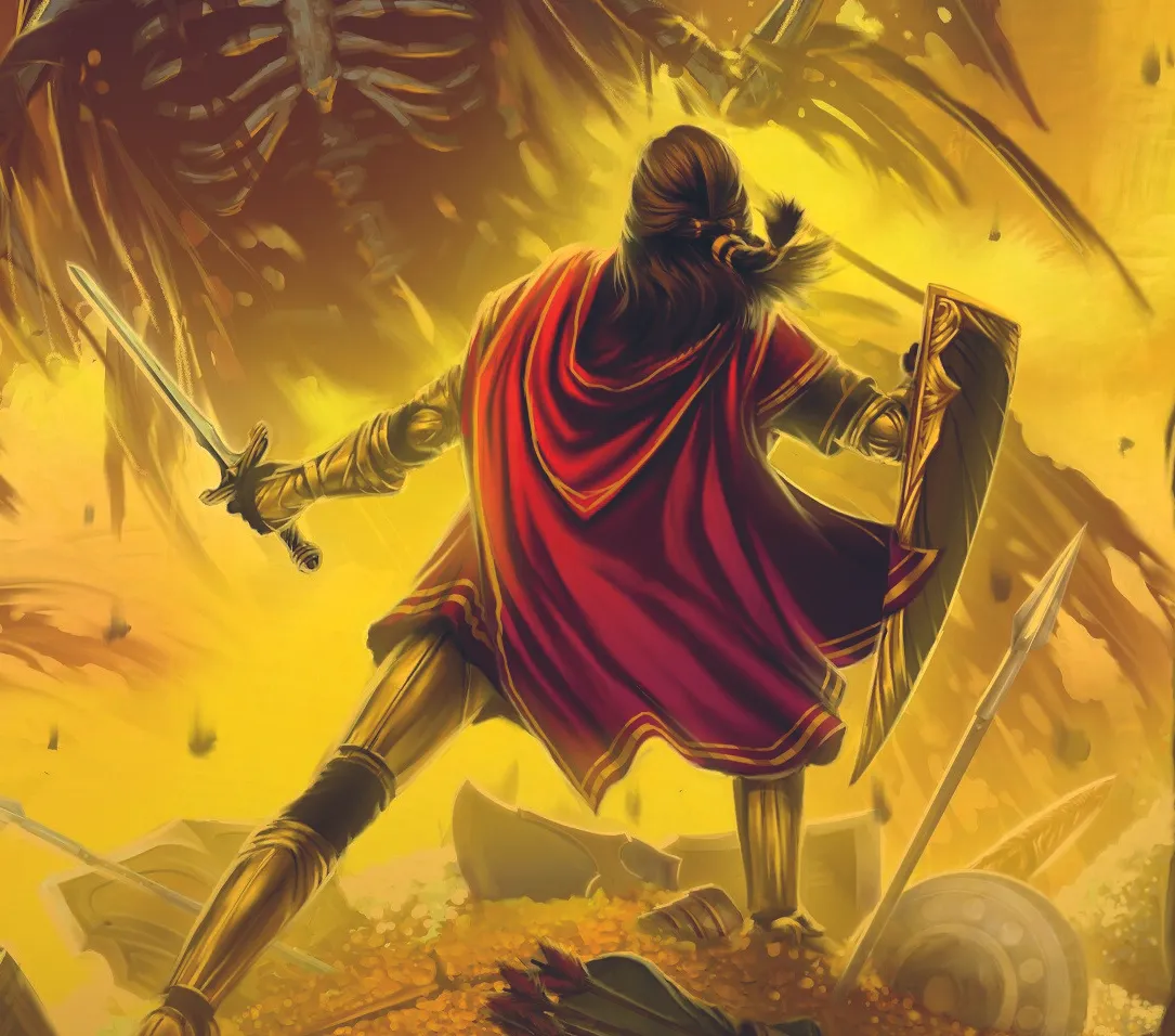
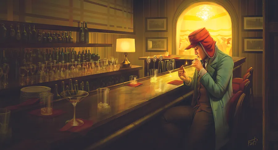
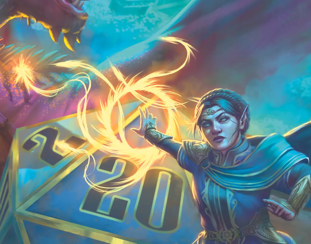
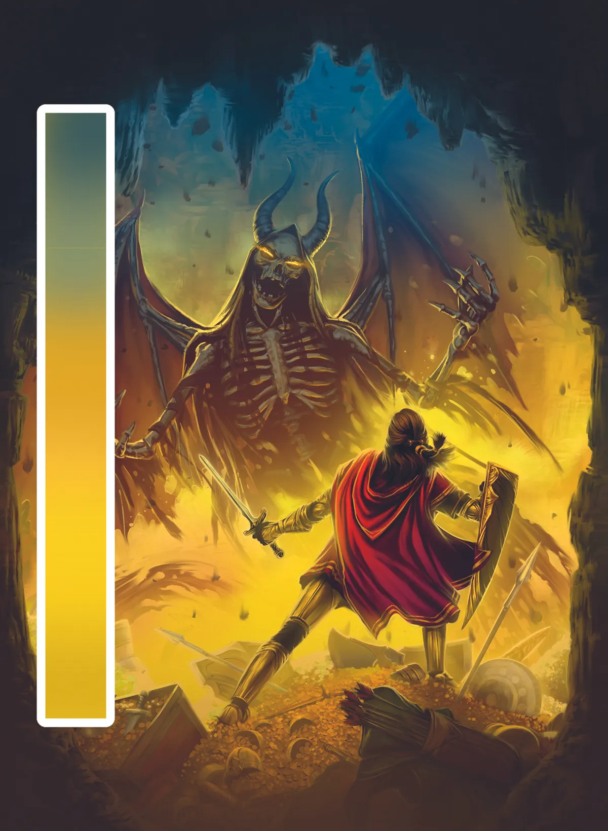
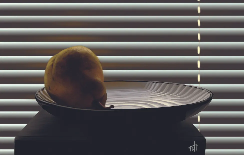
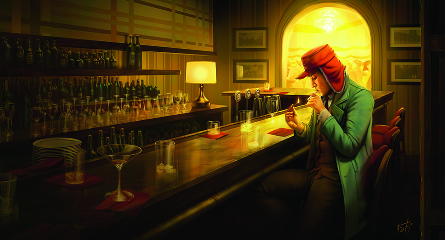
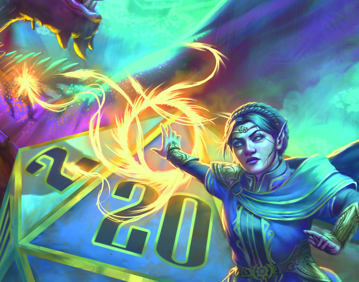
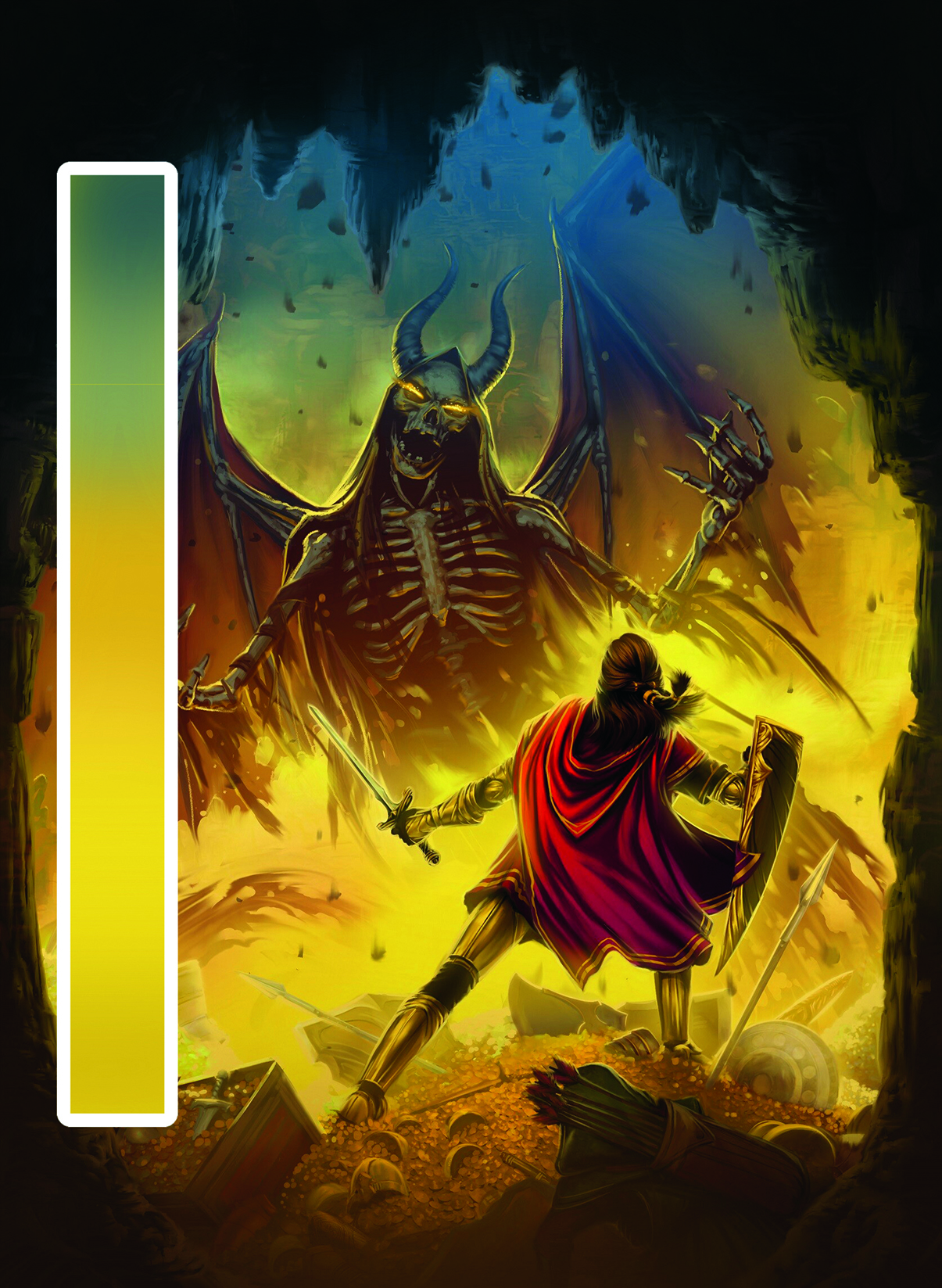
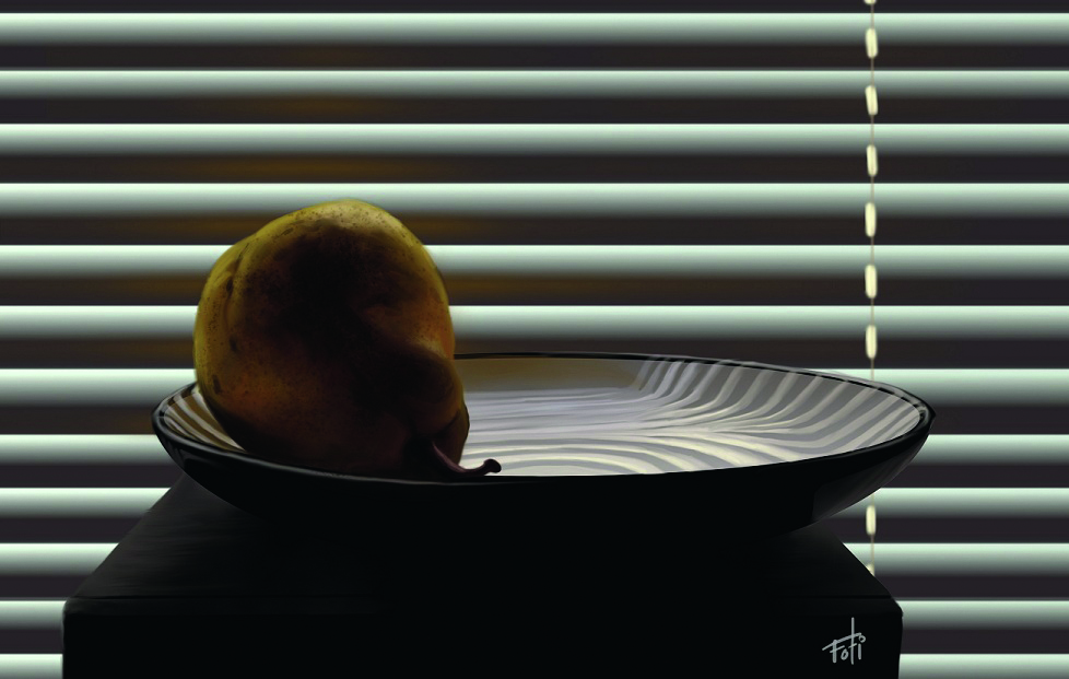
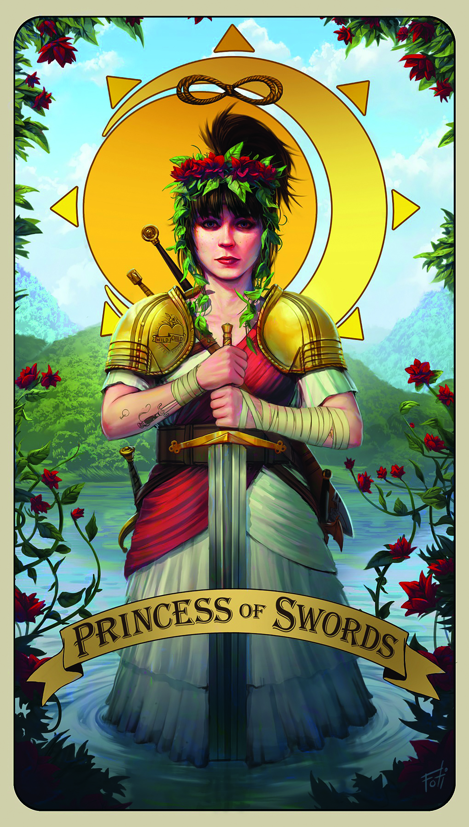
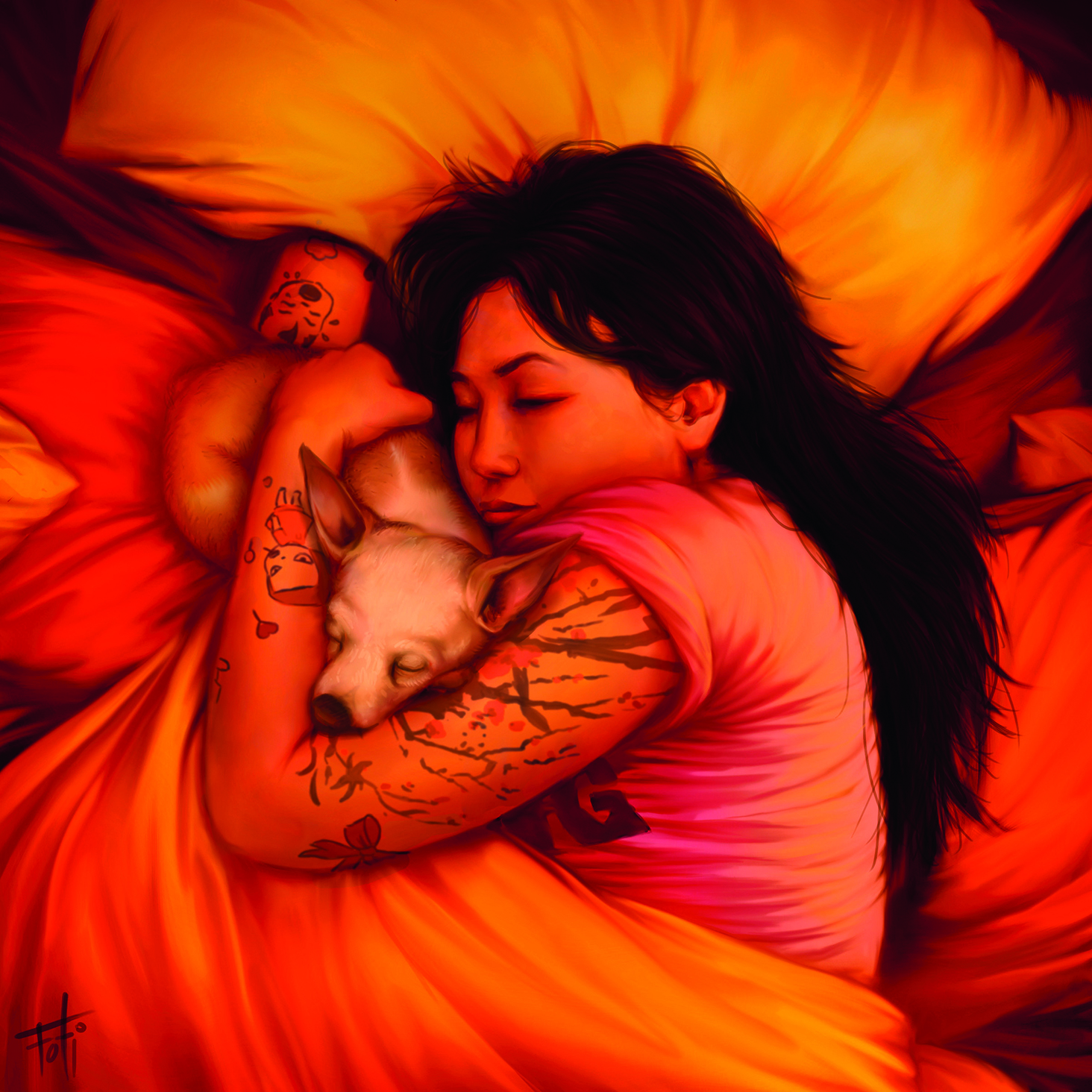
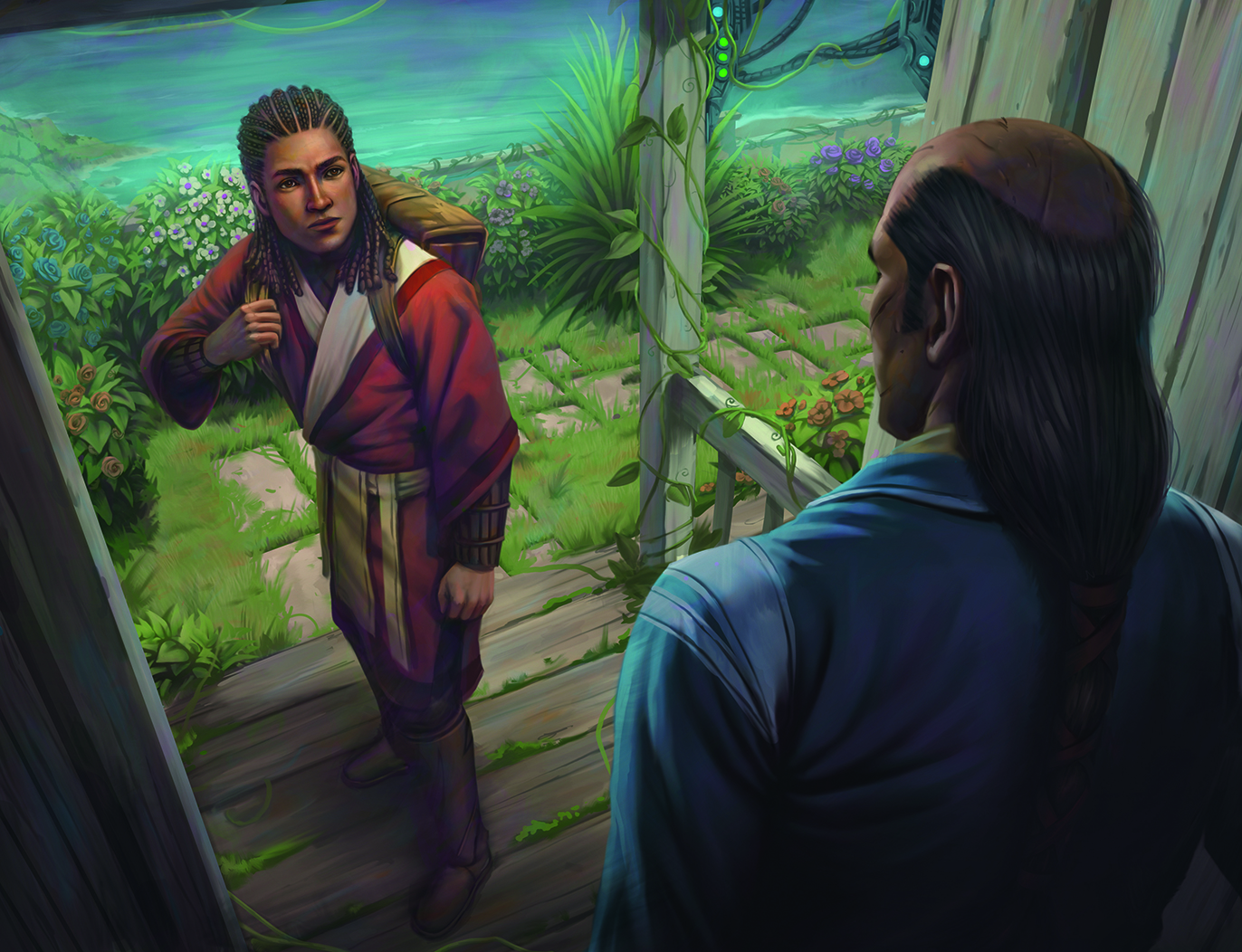
Colour is one of the most important tools an artist has. The way you use your palette has a significant impact of the mood of your piece and how it reads to the viewer. The same principles that guide line, shape and value design are all relevant to colour (also see our guide to colour theory ). Contrast, rhythm, texture, variety, shape… colour is just one more lane where you get to play with all that stuff. It can be scary for new artists, but it’s the bit you get to have most fun with. If art were a meal, the values are the protein and the colours are the spices. When you nail the values and shapes, the colour is very forgiving. 01. Simplicity and rest When realism is your goal, the colour of the light sources is the guiding factor in your colour design. If leaning into abstraction, it’s an endless playground. The goal is for you to understand that colour is here to make your life easier.…