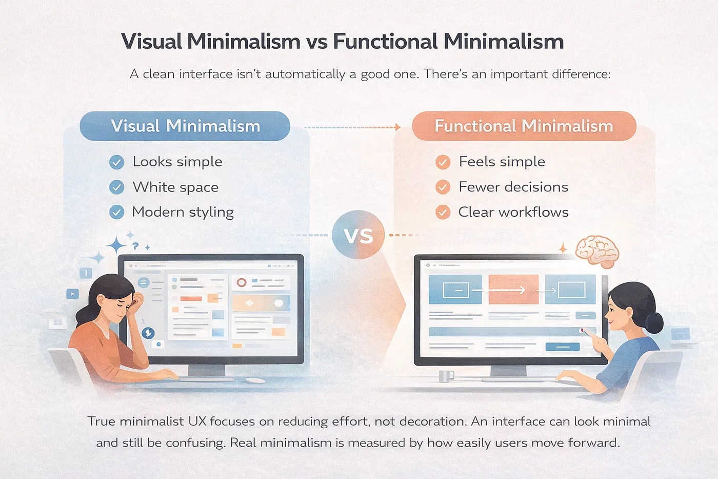
Press enter or click to view image in full size Why clean UI design is not always good UX. Learn how focusing on clarity instead of minimalism leads to better user experience and product success. Press enter or click to view image in full size Press enter or click to view image in full size Press enter or click to view image in full size There’s a lie floating around in the design world that nobody wants to question. The idea that clean UI equals good UX . At first glance, it makes sense. You open a product, everything looks neat, spacing is perfect, colors are subtle, and typography feels premium. It gives you that “wow” moment. But then something strange happens. You try to use it… and suddenly, you’re lost. You don’t know where to click. You don’t understand what action to take. And worst of all, you feel like the product is beautiful, but not useful. This is where most designers fail. They design for Dribbble likes , not for real users.…