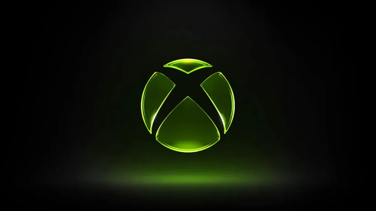
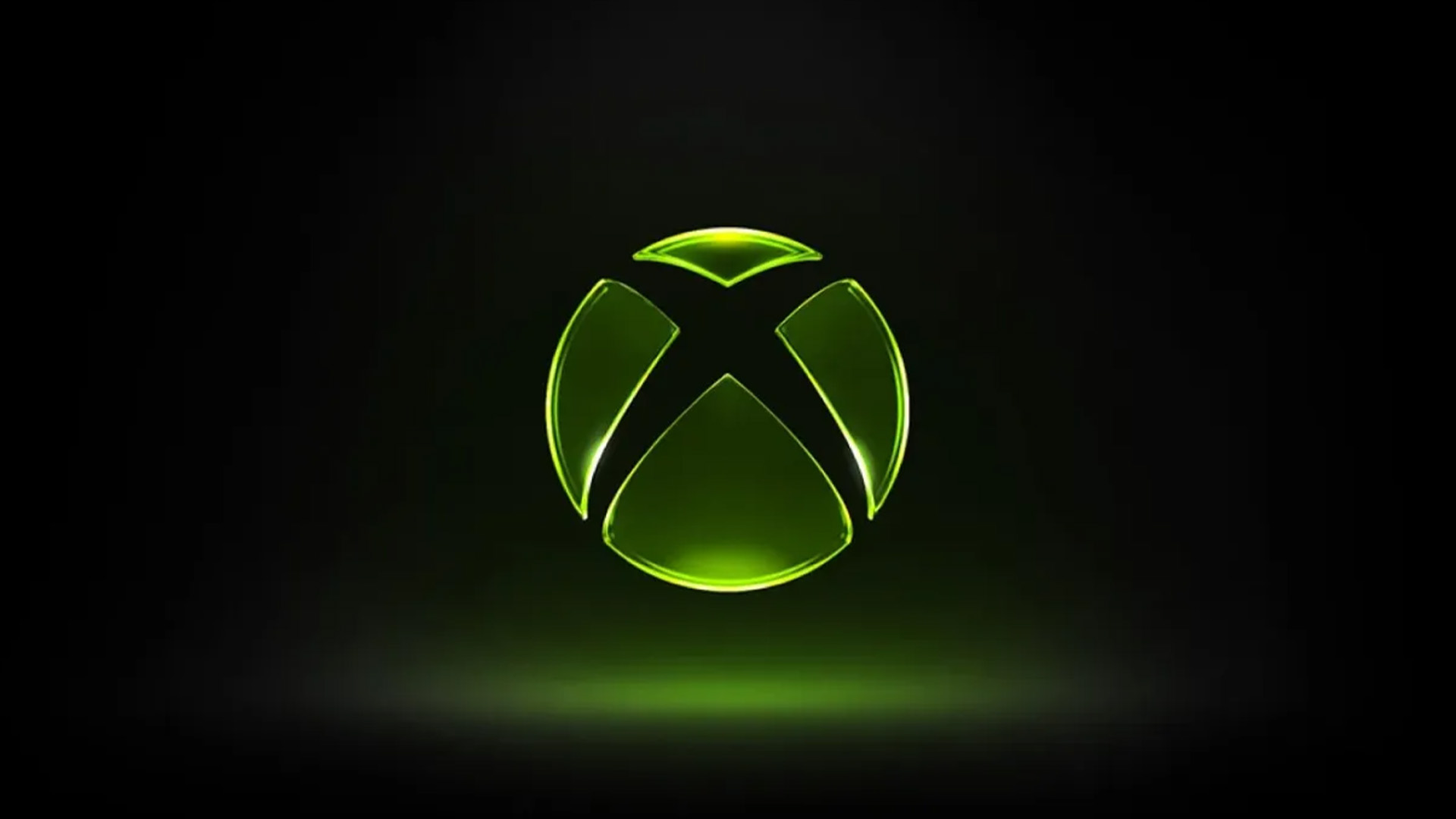
(Image credit: Apple/Microsoft/Future) Back when Apple revealed its new Liquid Glass design language to the world, it was widely mocked. Everyone from graphic designers to Microsoft piled on , claiming that the splashy, glassy UI was straight out of the noughties. But if the new Xbox logo is anything to go by, Microsoft isn't laughing anymore. This week, Xbox revealed a shiny and translucent take on the classic Xbox sphere which, with its neon green colouring and ostentatious lighting, looks like a knowing throwback to the brand's early aesthetic. But it's also reminding plenty of people of, yep, Liquid Glass. It’s official, Liquid Glass is now the design language of the era https://t.co/lNe6BhzlDd April 24, 2026 In a world of brands bringing back their old logos , it's hardly surprising that Xbox is going for nostalgia with this one. The skeuomorphic glassy aesthetic looks straight out of the original Xbox dashboard – something plenty of fans have picked up on.…