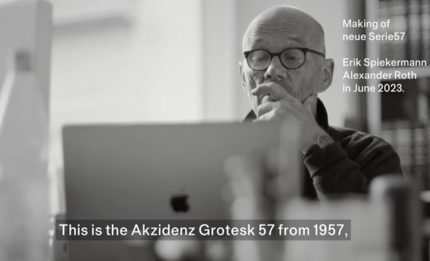
06.12.23 The original Akzidenz Grotesk Serie 57 in 16pt lead type in a case a p98a workshop Of course I had seen Akzidenz Grotesk Serie 57 in the Berthold specimens and knew that the weights from 14 point onwards looked different from the smaller text weights, which had been made available for the Linotype. But I had never thought about the design process, even though 1957 was such an important year for typography: Helvetica, Univers! We do know that the first publication of a hot metal typeface rarely marks the beginning nor the end of a years-long process of development, but there must have been a reason why Günter Gerhard Lange chose exactly this year to name the face. The design of the text sizes for machine setting was not changed, only the widths were adapted for the Linotype system. They were available as early as 1957 and could be combined with the Akzidenz Grotesk weights for handsetting.…