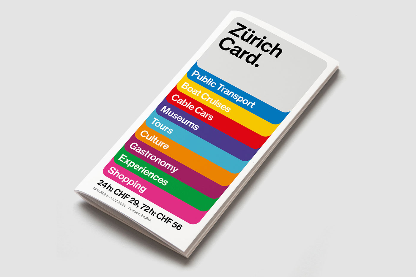
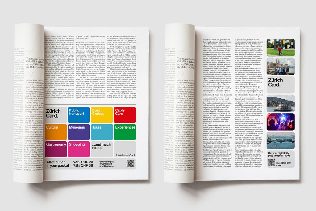
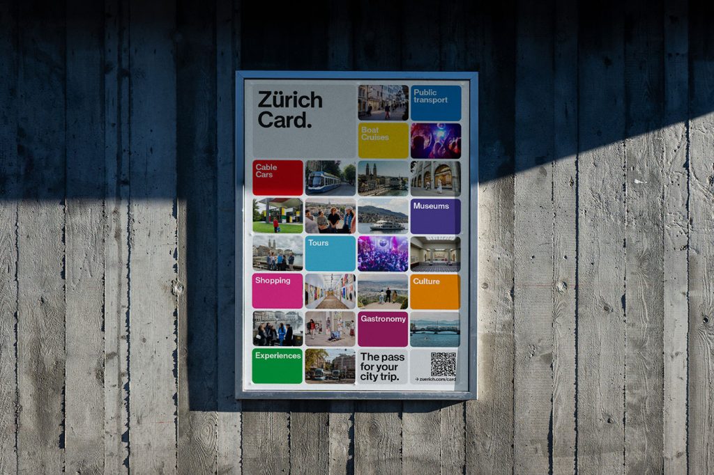
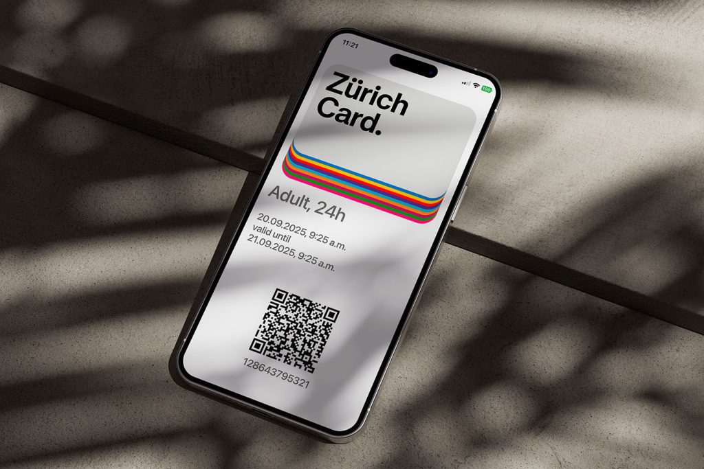
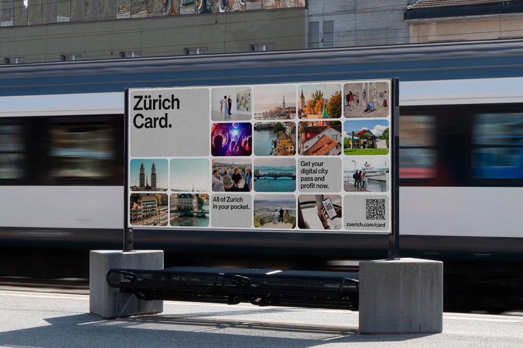
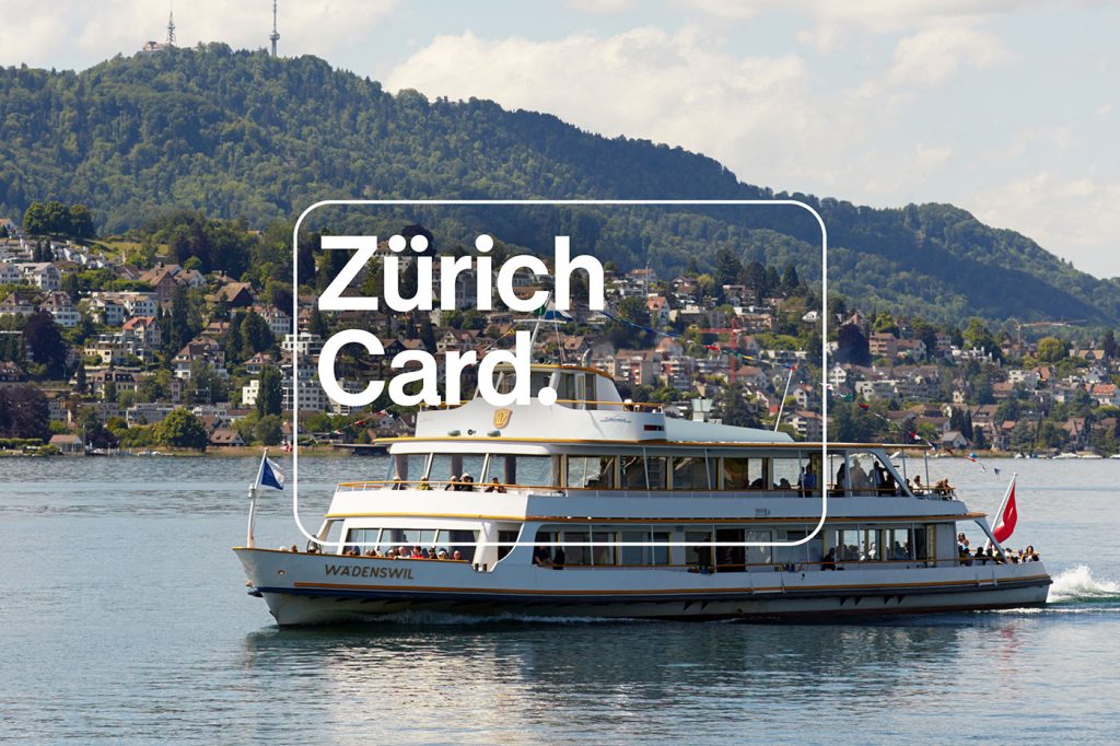
Most city passes look like something you’d shove in your wallet and forget about. The Zurich Card just got the opposite treatment—thanks to Studio Marcus Kraft , it now looks like a piece of design you actually want to show off. The redesign is built around a stylised card shape , and it’s surprisingly versatile. On one poster it frames a moody photo, on another it morphs into a mosaic of bright squares, and online it flexes into animations. It’s not just a logo—it’s a design system with Swiss-level precision. Think grid logic meets emotional storytelling. And yes, the typography is exactly what you’d hope for from Zurich. Clean, no-nonsense, and very much in line with the Swiss International Style —but with just enough personality to keep it from looking like Helvetica’s sensible cousin. The type works hard, the layout feels modular, and everything connects back to Zurich Tourism’s broader identity system (also created by the same studio, back in 2017).…