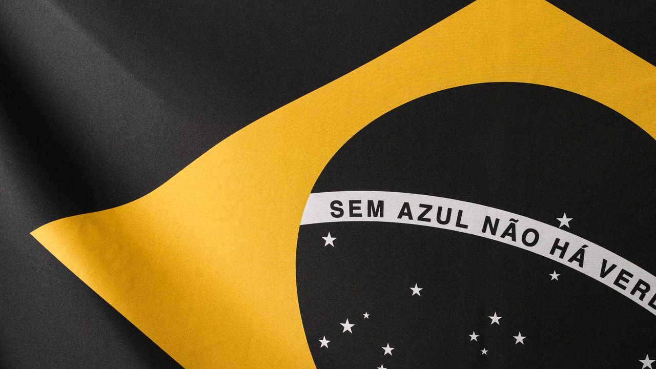
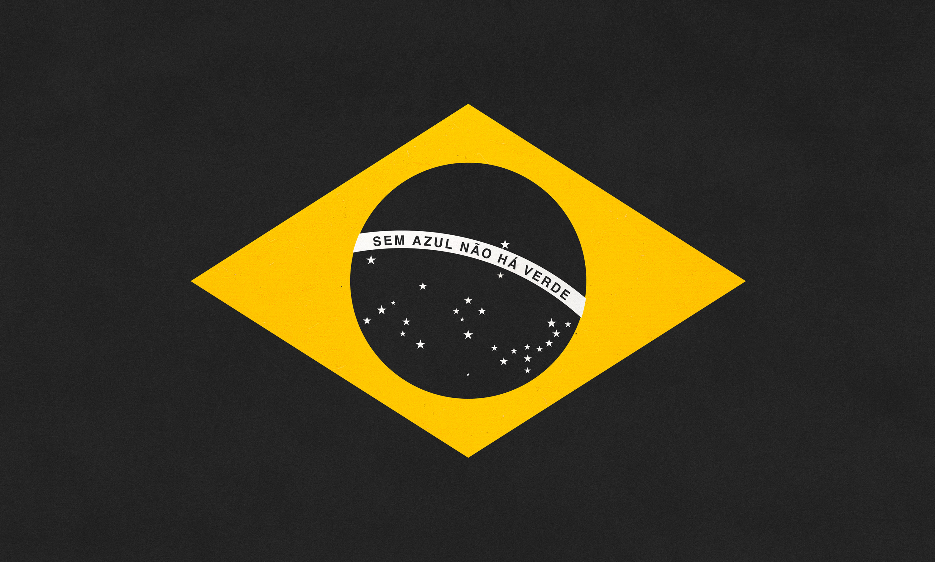
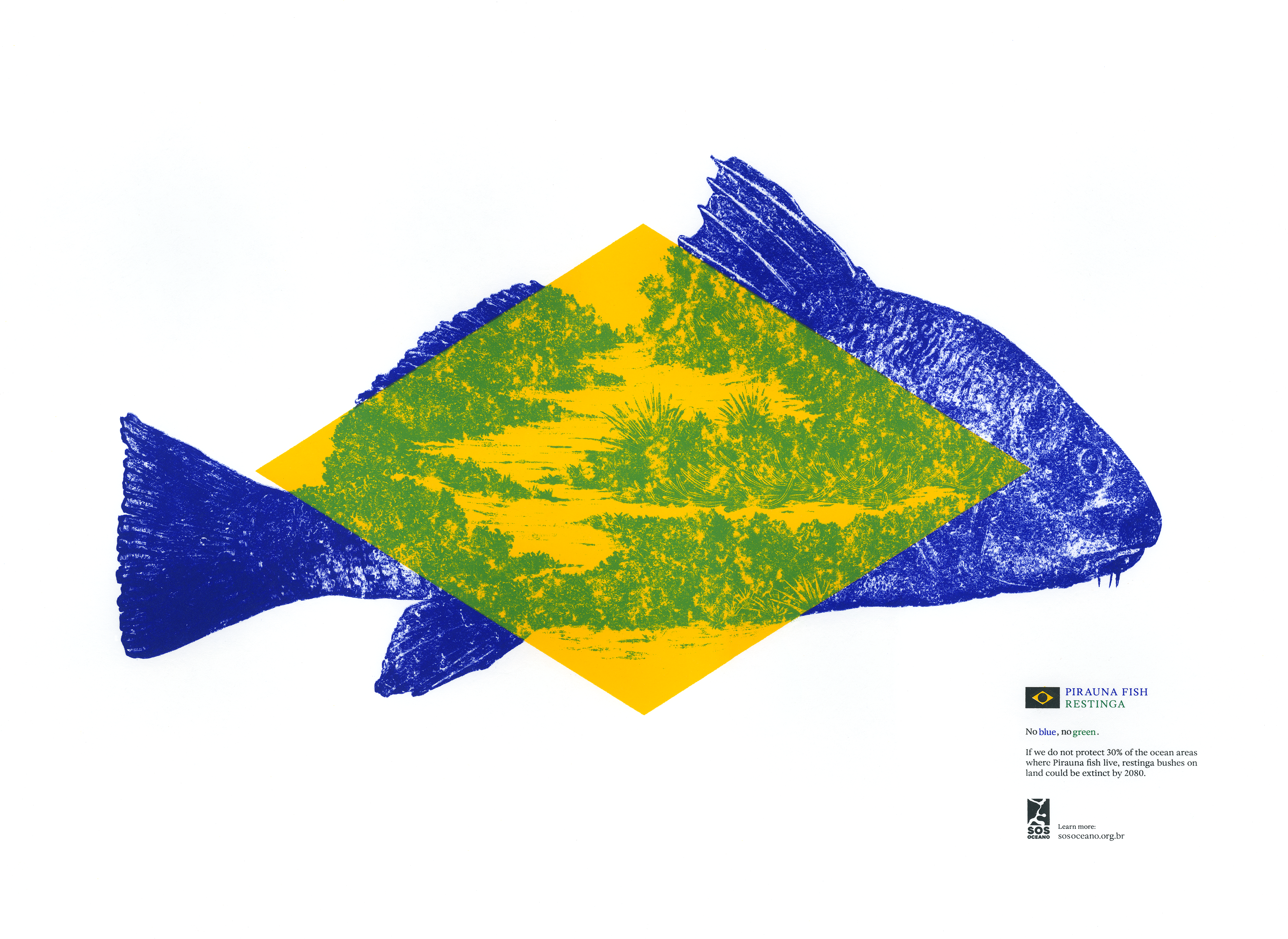
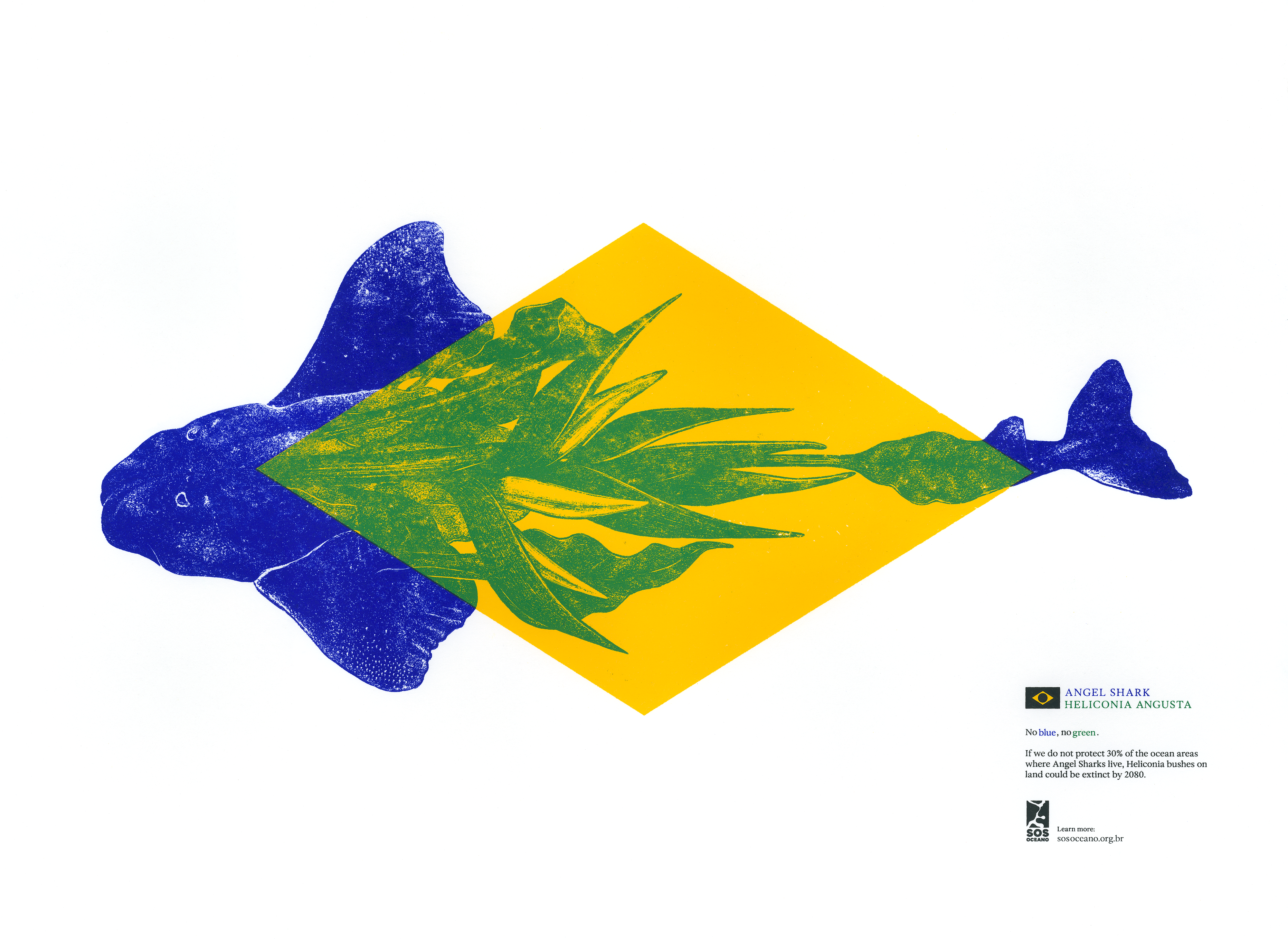
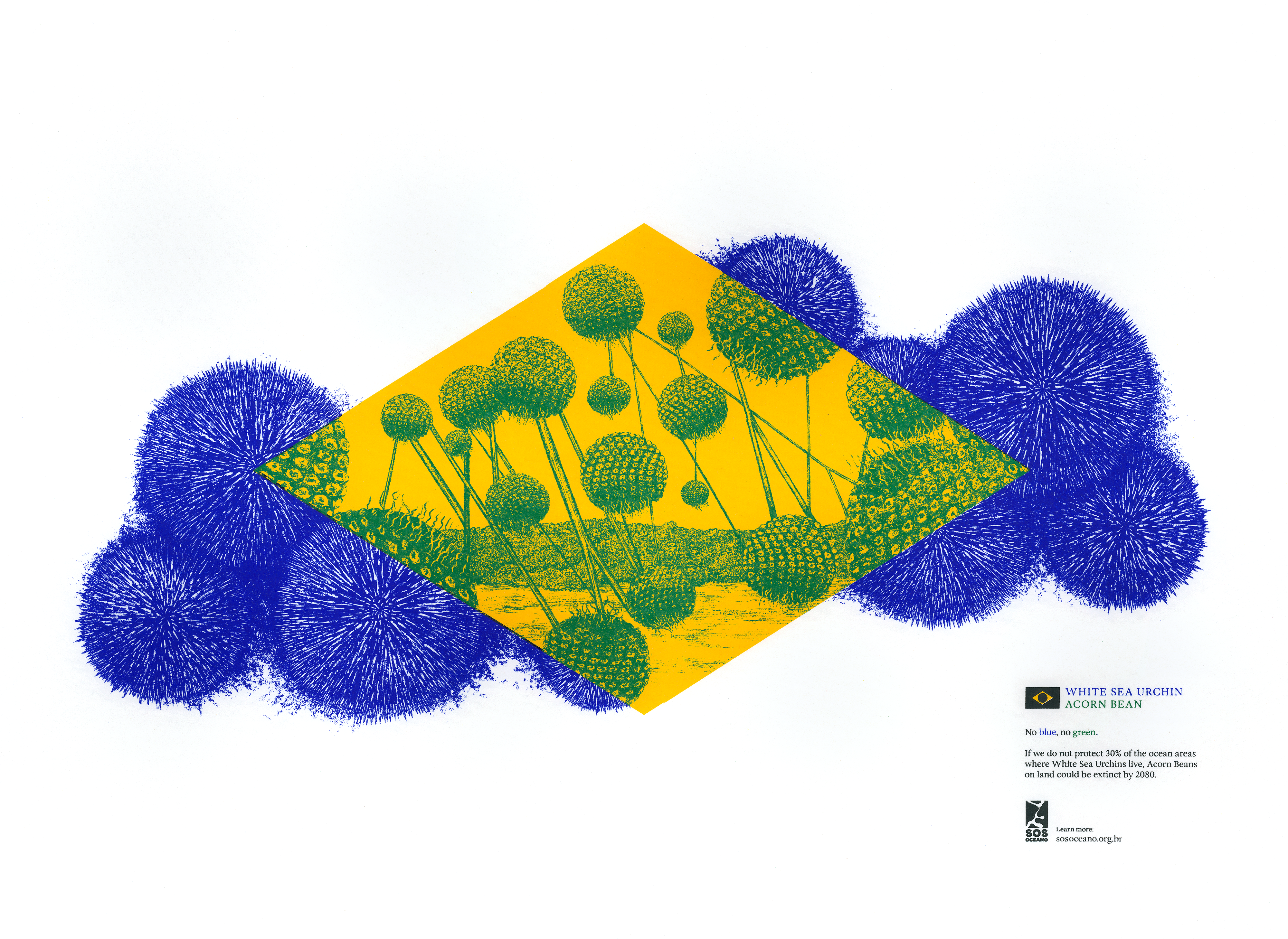
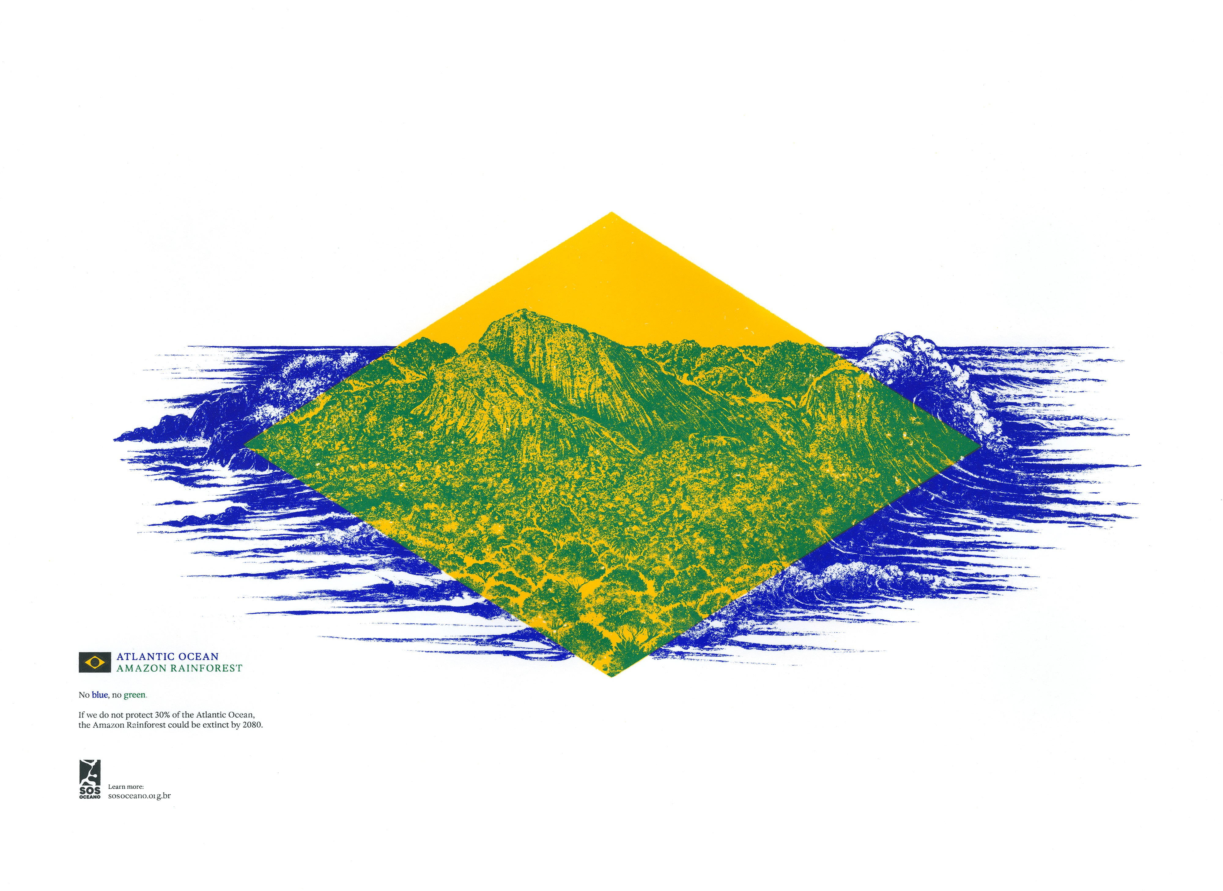
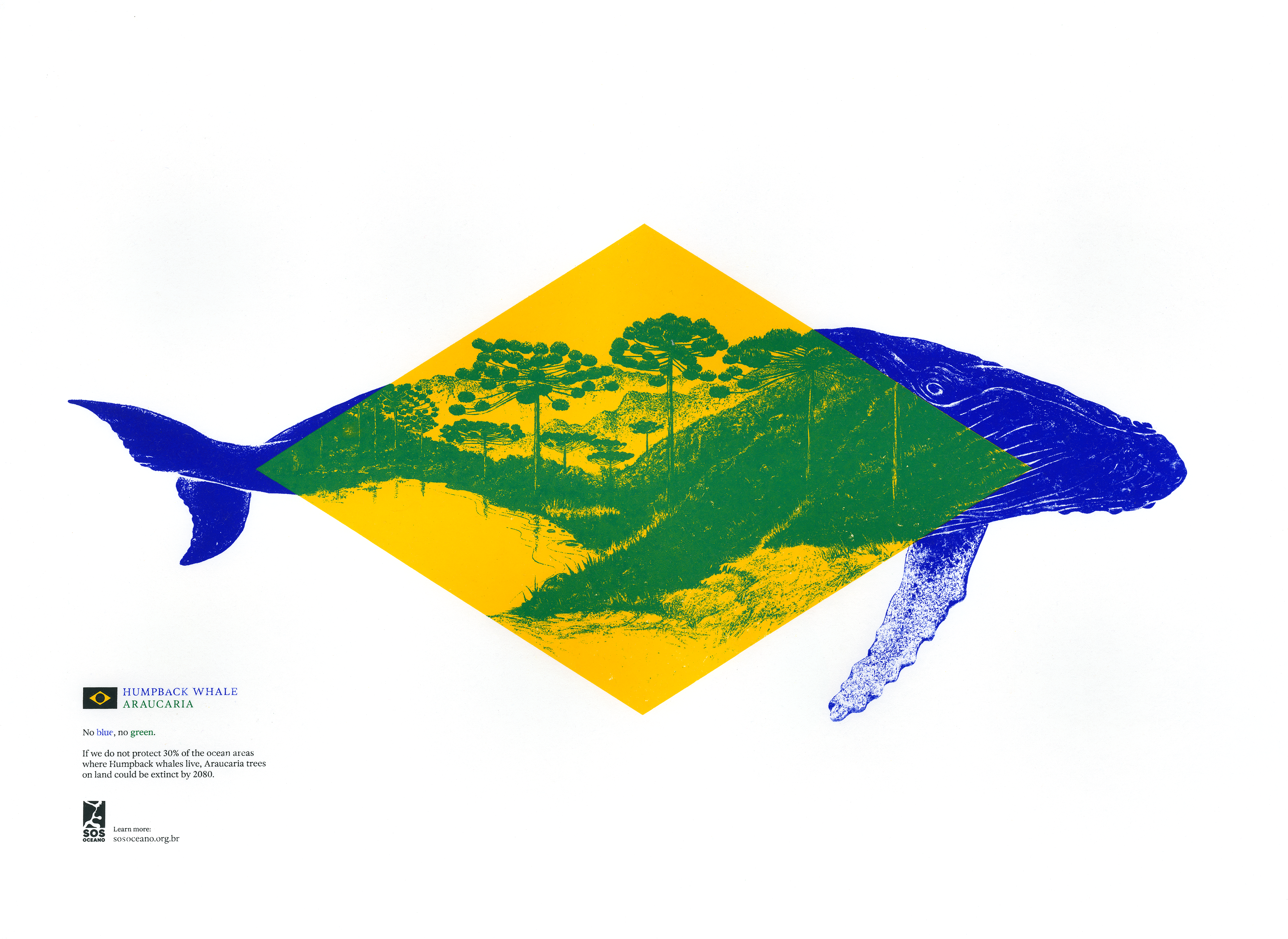
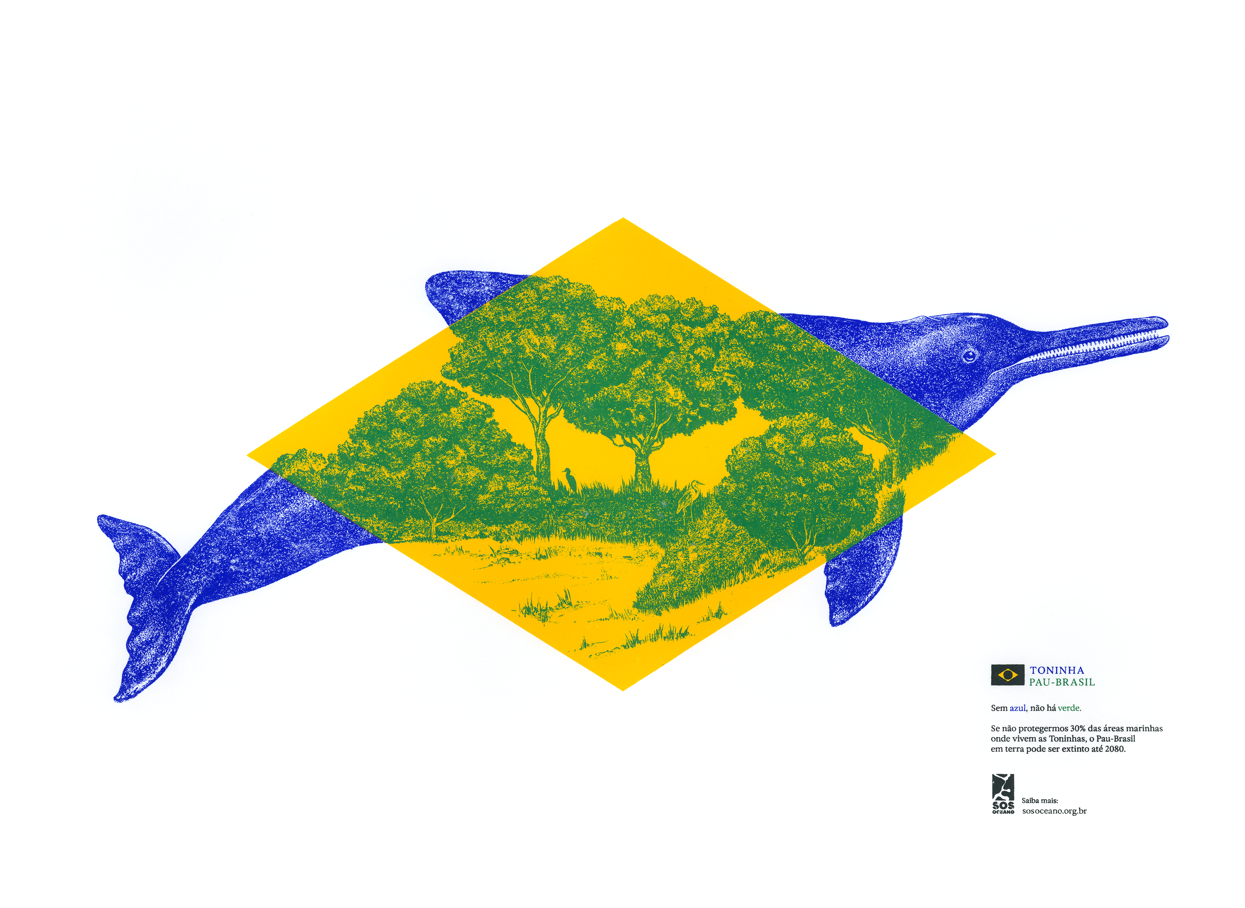
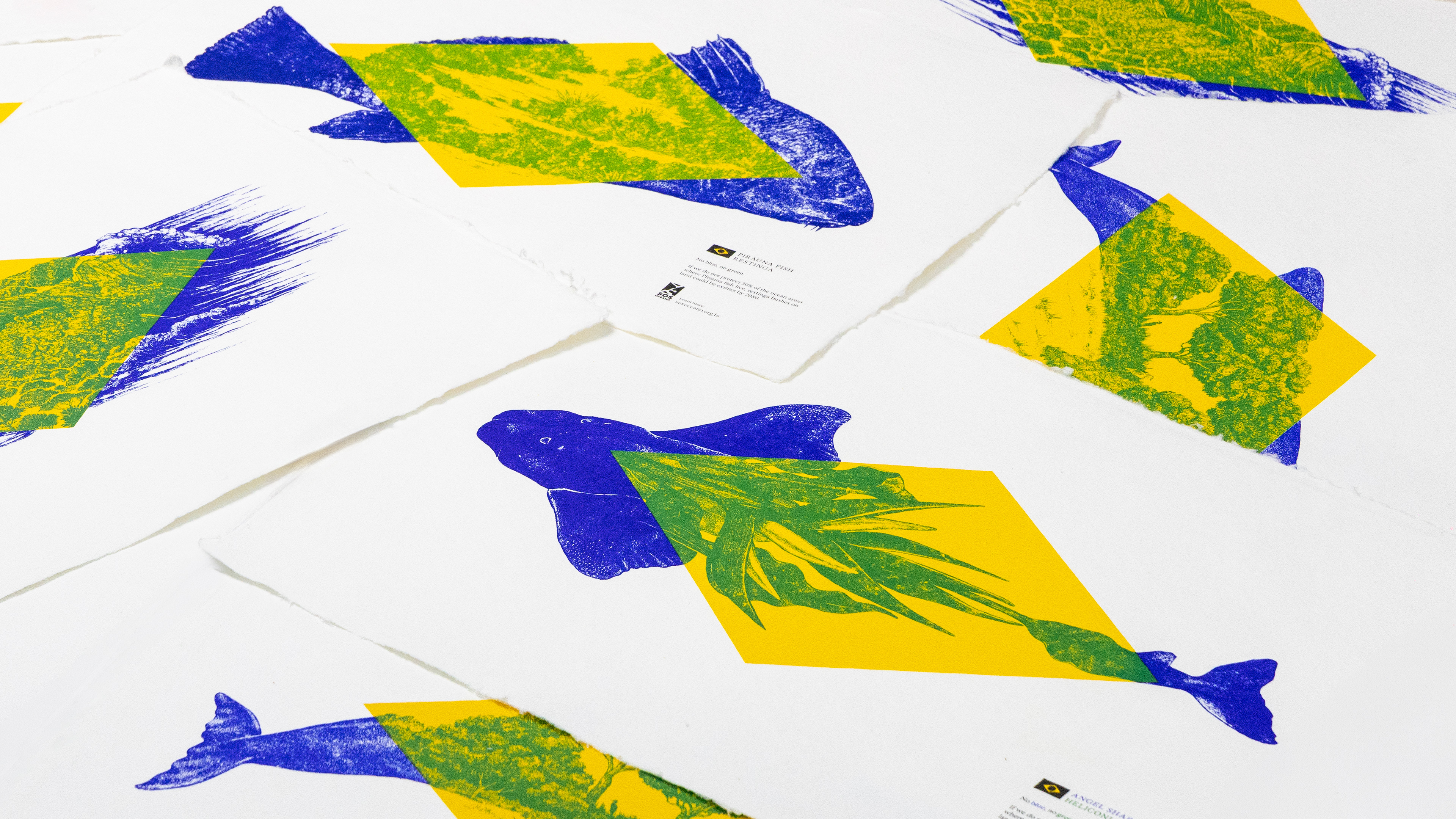
(Image credit: Droga5 São Paulo) The colours of national flags carry a lot of power, as we're sure to see with World cup 2026 coming up. One creative agency has shown how that can be use to communicate more than just national pride. While the green and yellow of the Brazilian flag were originally taken from the royal houses of Hapsburg and Braganza, they were later re-interpreted to represent the country's Amazon and Atlantic forests and gold reserves, with the blue circle representing the night sky over Rio. But what if the colours disappeared? That's the question Droga5 São Paulo asked a few months ago with its Lifeless Flag campaign during the COP30 meeting in Belém. Now it's bringing the colour back to complete the message. Droga5 São Paulo 's Lifeless Flag campaign was created for SOS Oceano, a coalition of NGOs advocating for the expansion of marine protected areas. The first phase saw the blue and green removed from the Brazilian flag to stress that one can't exist without the other.…