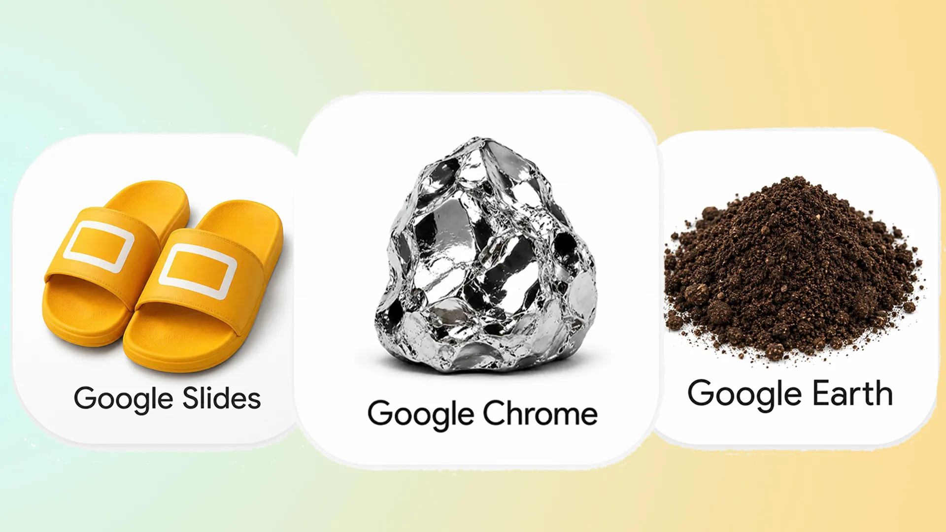
(Image credit: @immasiddx/@Bybit_Romanian via X) Google recently revamped its app icons, much to the joy of users who had grown tired of the brand's 'unified' (a.k.a. indistinguishable) old designs. While anything would've been an improvement, the new icons have been surprisingly well received, prompting some X users to share their own alternative designs. Ranging from playful to ridiculous, these alternative logo designs take a hilariously literal approach to icon design. While admittedly some are pretty silly, they're instantly recognisable, demonstrating the visual power of skeuomorphic design. hear me out https://t.co/GG2X4Ix7MC pic.twitter.com/feukMMBMcI May 24, 2026 It began with a simple tweet from X user Amichai Mantinband, who shared a simple reworking of the new Google Sheets logo with the caption "hear me out".…