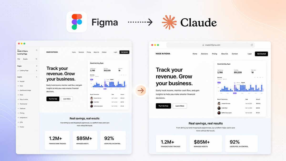
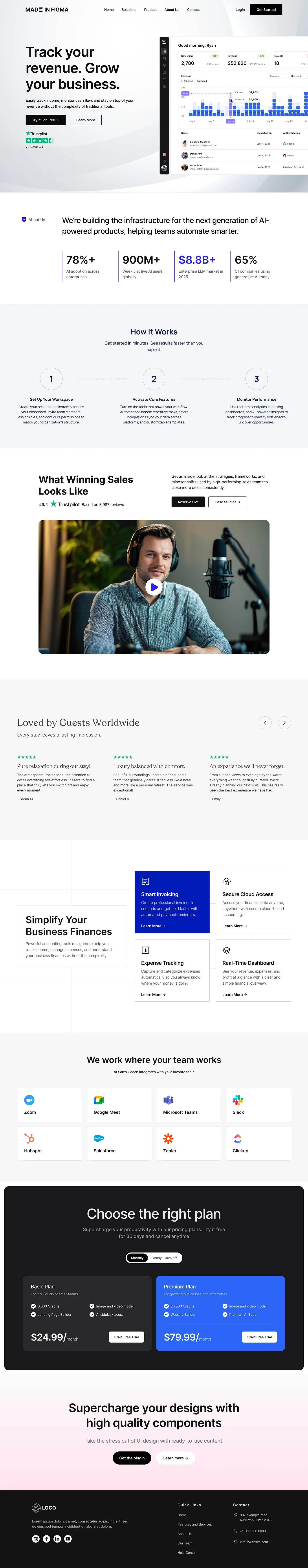
Step 1: Designing the page in Figma If you’re going to test something like this, you can’t half-do it. I wanted to see if Claude could handle a proper, high-quality landing page. The kind you’d actually ship. So I started where I always start. Structure. Before touching a single pixel, I mapped out the layout: Hero Statistics How it works Testimonial section Features Pricing More features Integrations CTA Footer Nothing fancy here. Just a solid, conversion-focused structure that most SaaS landing pages follow. Once the skeleton was in place, I moved into design. Instead of building everything from scratch, I used the Figma design library, MadeinFigma . The whole point was speed without compromising quality. Components are already structured properly, spacing is consistent, typography is dialed in. And that changed everything. What would normally take hours took me about 8–9 minutes. Not because I rushed it. But because everything was already built to work together. Hero section dropped in. Adjusted copy.…