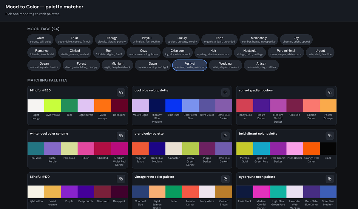
The Personal Workflow That Started It Before building the tool, my color workflow looked something like this: 1. Search Pinterest, Twitter/X, or design blogs for inspiration. 2. Save screenshots or color palette images. 3. Open images in Figma, Photoshop, or a browser tool. 4. Use an eyedropper to extract colors. 5. Copy the HEX codes manually. 6. Try them in a website, brand deck, poster, or graphic. 7. Repeat because the first palette often did not work. It was enjoyable in a treasure-hunt way, but slow. The friction was not just collecting colors. The real problem was that I had no structured way to answer: What mood does this palette actually create? A palette with greens could be forest, clinical, earthy, fresh, or toxic-neon depending on: - hue, - saturation, - brightness, - temperature, - contrast, - tone, - and how the colors relate to each other. So I decided to build a database and scoring system.…