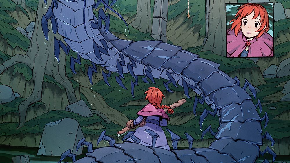
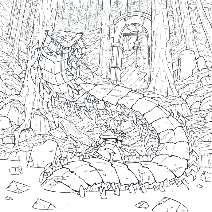
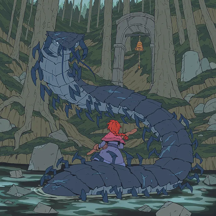
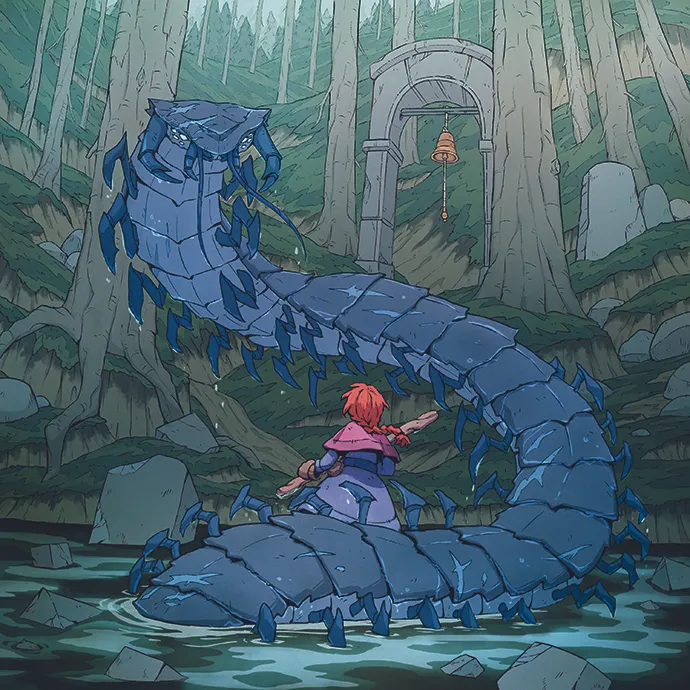
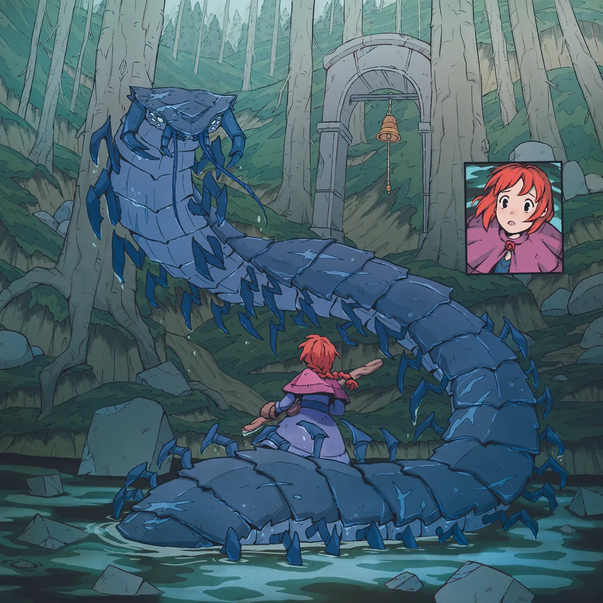
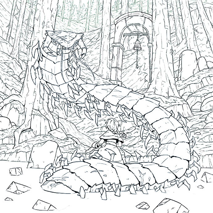
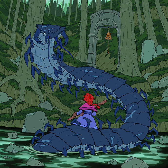
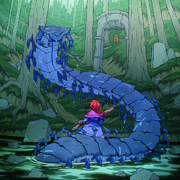
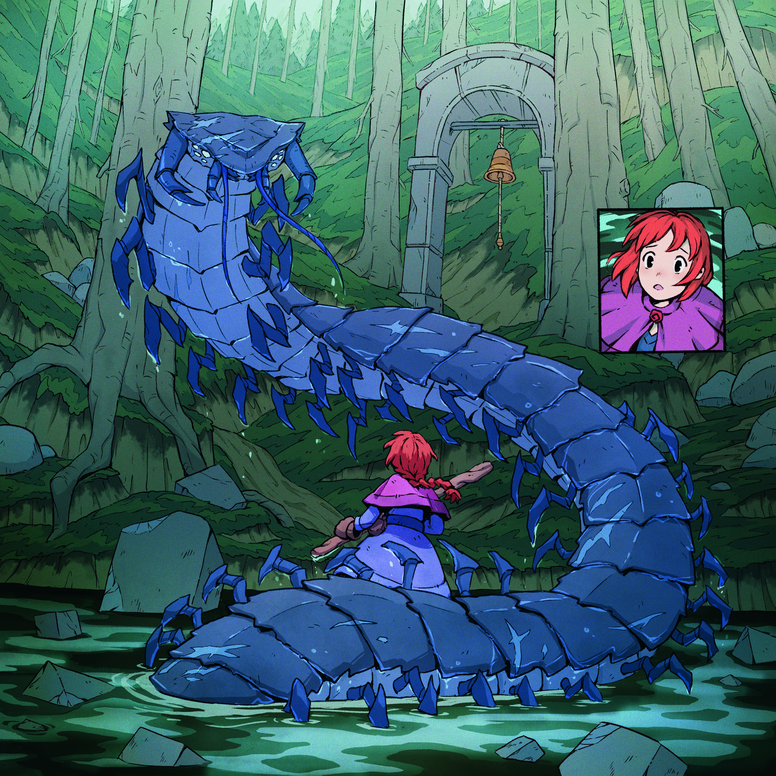
For this piece, I wanted to capture the cool, dark depths of the woods. This is also a dynamic moment where the character startles a monster that’s rising out of the water. In the past, I’ve often found it challenging to balance detail when I’m inking a piece like this. I don’t want my illustrations to be too busy; they should have a clear, graphical look. To help me achieve this, I’ve recently started colour blocking. This takes the guesswork out of designing the right shapes and balancing details, and helps me to see whether I’m getting the right end result at an early stage. 01. Lively ink Inking is my favourite part of the process. I think of it as drawing neatly, rather than making every line perfect. I use a textured ink brush at about 50% flow, and will often break up my lines to distress them. Once I’ve done my first ink pass, I always go back in and add some graphical black shapes. 02. Colour block To help design graphical shapes, I’ll start colour blocking while I’m inking.…