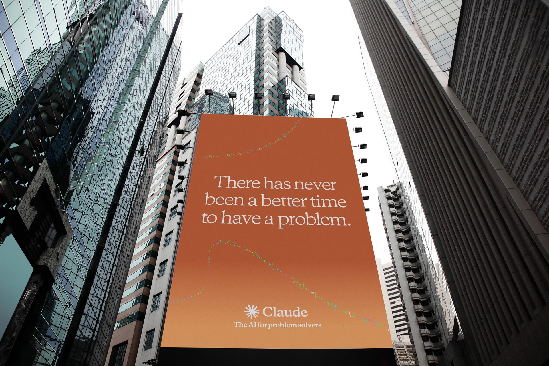
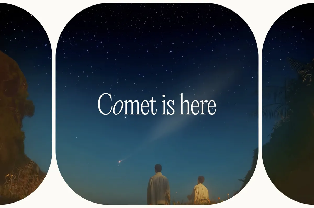
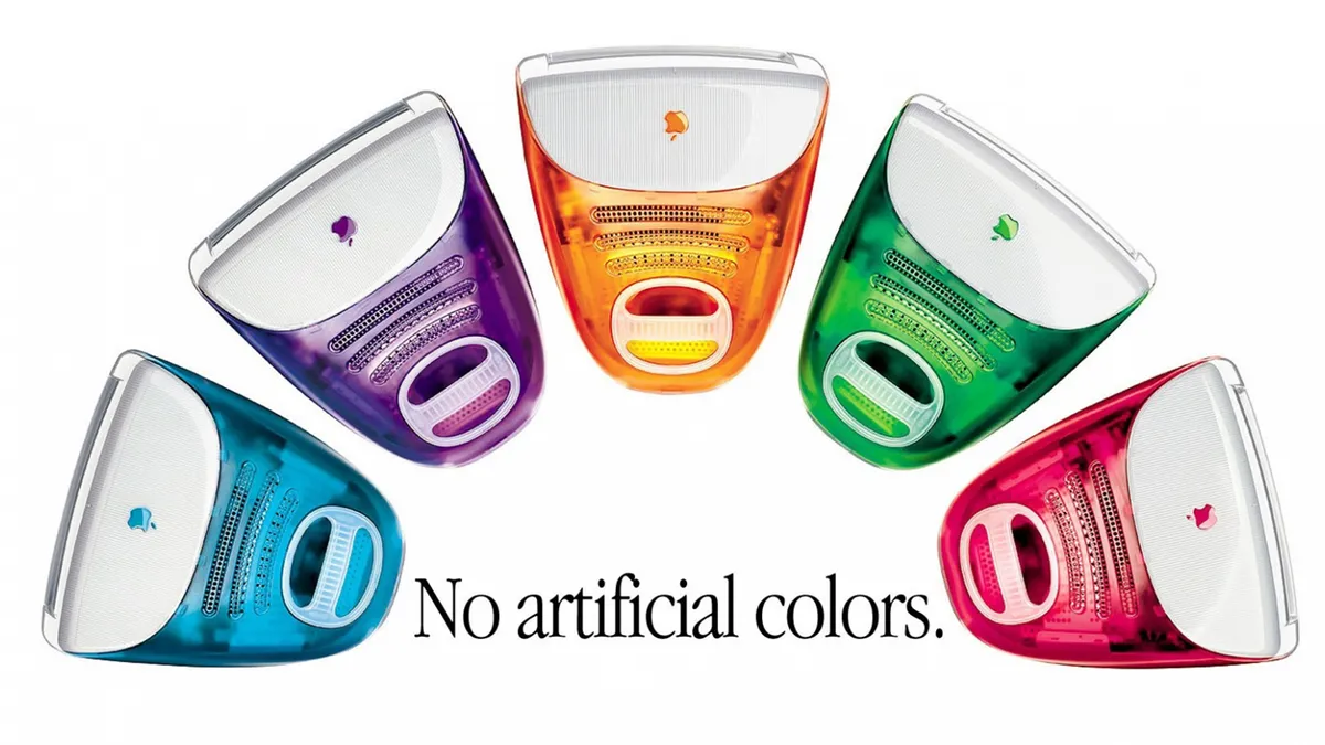
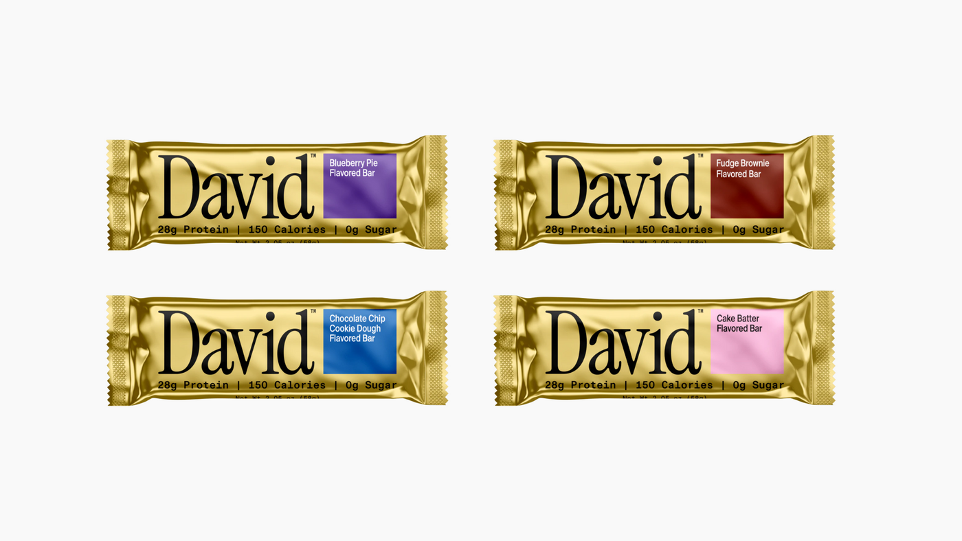
Claude uses serif fonts across its user interface and ads (Image credit: Anthropic) Haven't you heard? Serif fonts are back. While brands have been all about blocky minimalism, flat design and sans serif typography for the last decade, we've started to see a shift back towards more elegant text. The tide is turning on the serif vs sans serif debate, but the shift to a more analogue appearance is bring driven by a somewhat unexpected force: AI. From Perplexity to Claude, AI brands across the board are reaching for the warmth and familiarity of serif fonts. The look is decidedly retro, bringing to mind those Apple ads of the early 2000s. And the trend is making its way into other areas of branding too, even adorning packaging for protein bars .…